

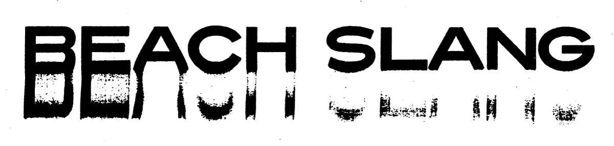
Beach Slang
File Under: Logo & Wordmark Development, Apparel Design, Poster Design & Screen Printing, Book Design
From 2013 through the summer of 2016, I started and subsequently played in a band called Beach Slang. Initially called "Slugger", we started off as just another exercise in making music for fun then quickly, over the course of a year or so, exploded into a band that played and toured nearly 6 or more months out of the year. We were very fortunate to have played in front of some illogically huge crowds in some of the worlds most beautiful cities along side bands that I have personally looked up to since before I was even a teenager. In addition to drumming in Beach Slang, I created nearly all of the merchandise and type treatments that we used. Below is a selection of that work.
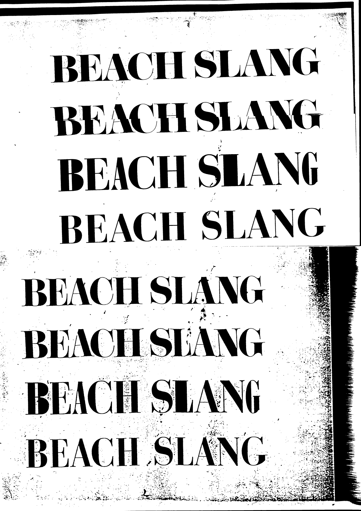
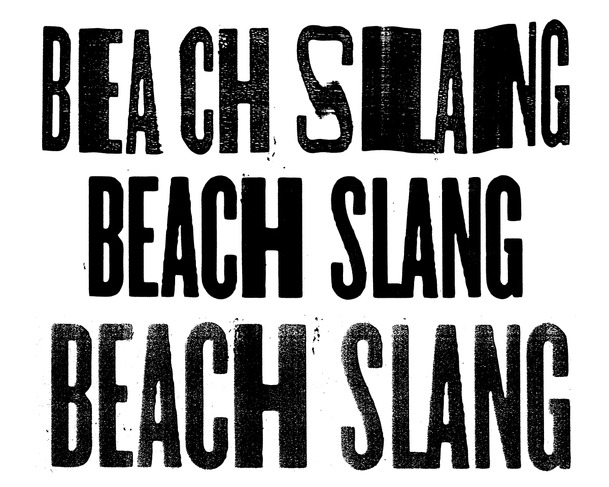
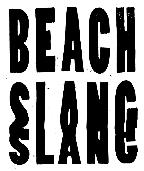
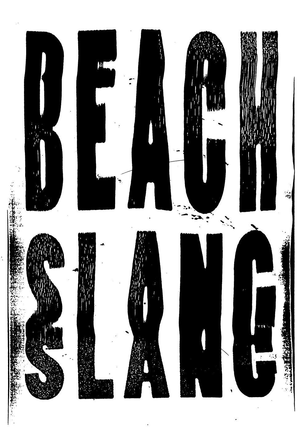
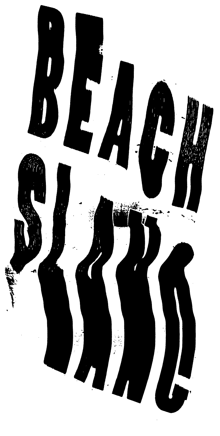
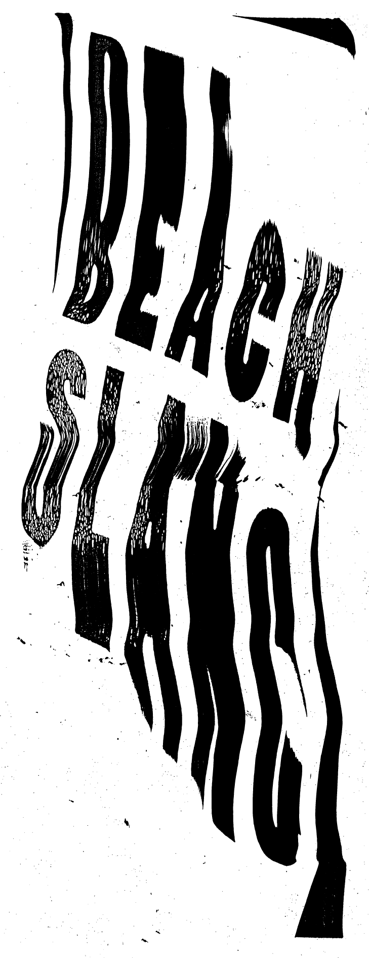
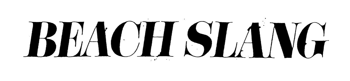
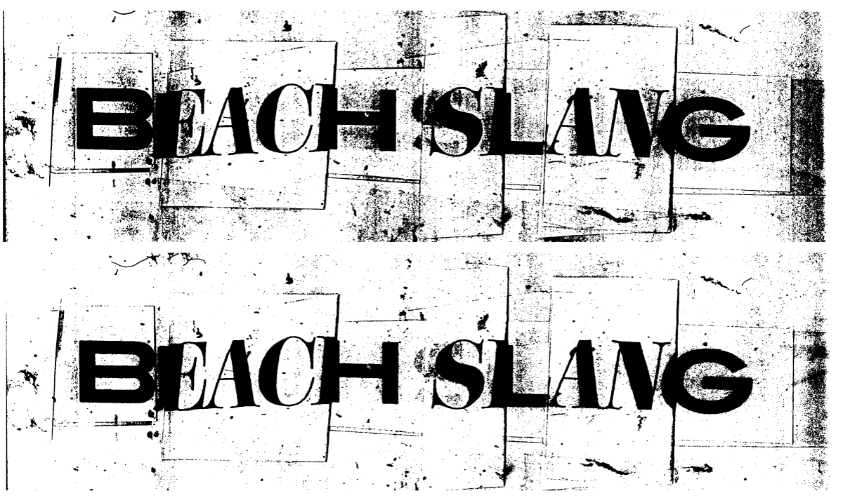
logo and word mark DEVELOPMENT
I used my beat up old copy machine at some point in my process for nearly everything I created for the band - especially type. Dragging the type along the bed of the copier as the scanner moved below the page, then repeatedly blowing-up and shrinking the image afterwards gave me some pretty cool results. Below is a small selection of the word marks I created using that technique.
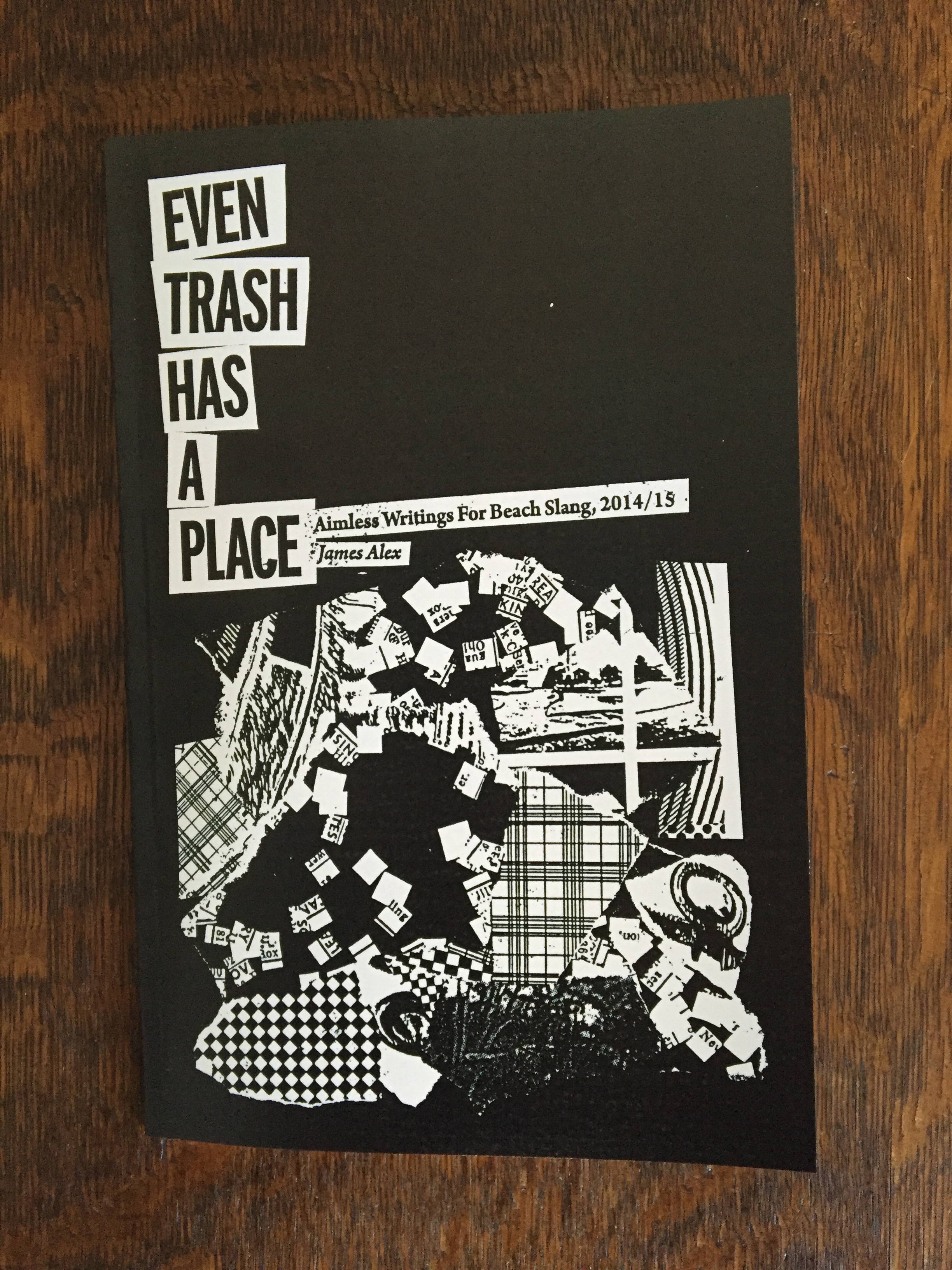
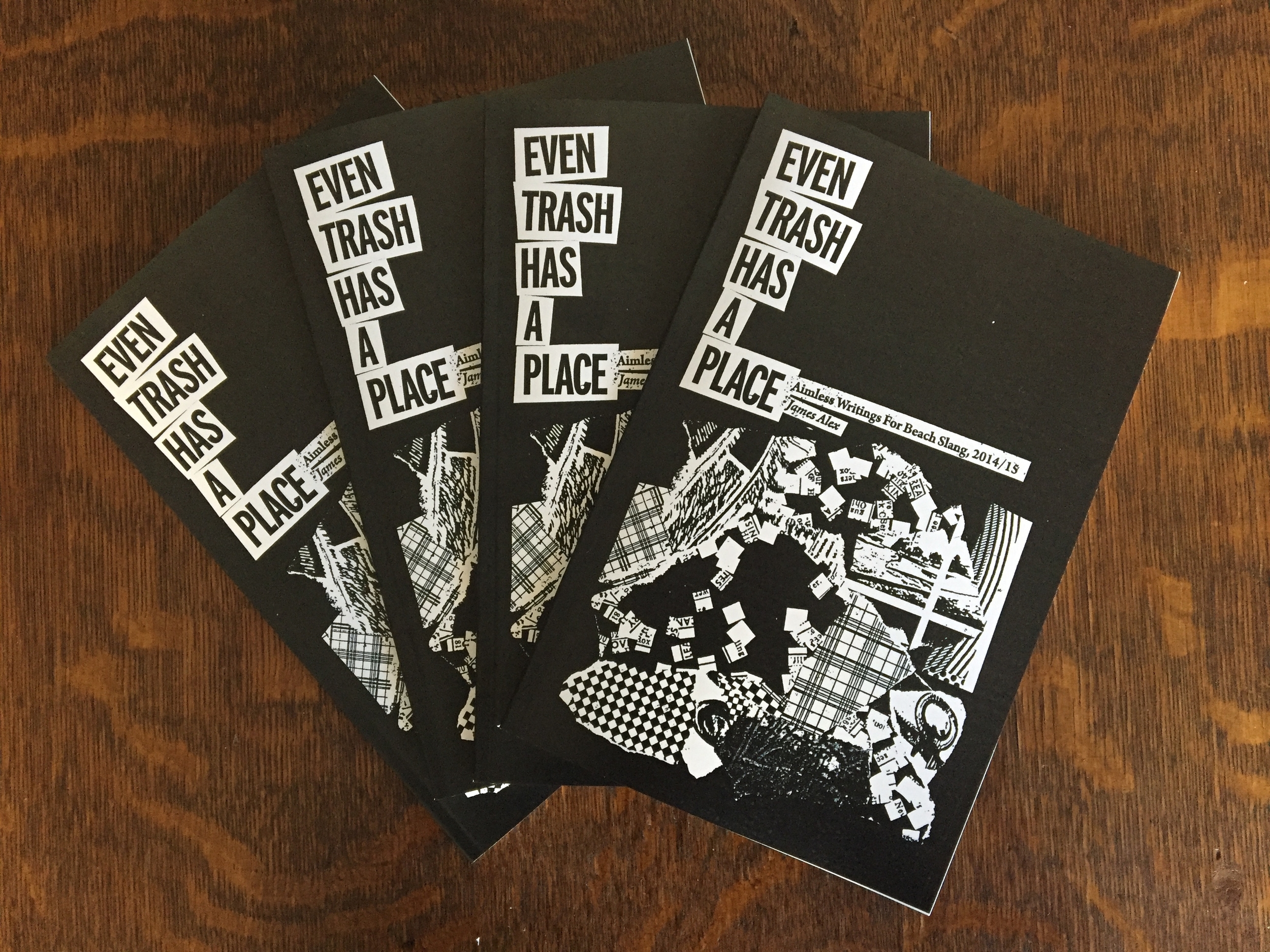
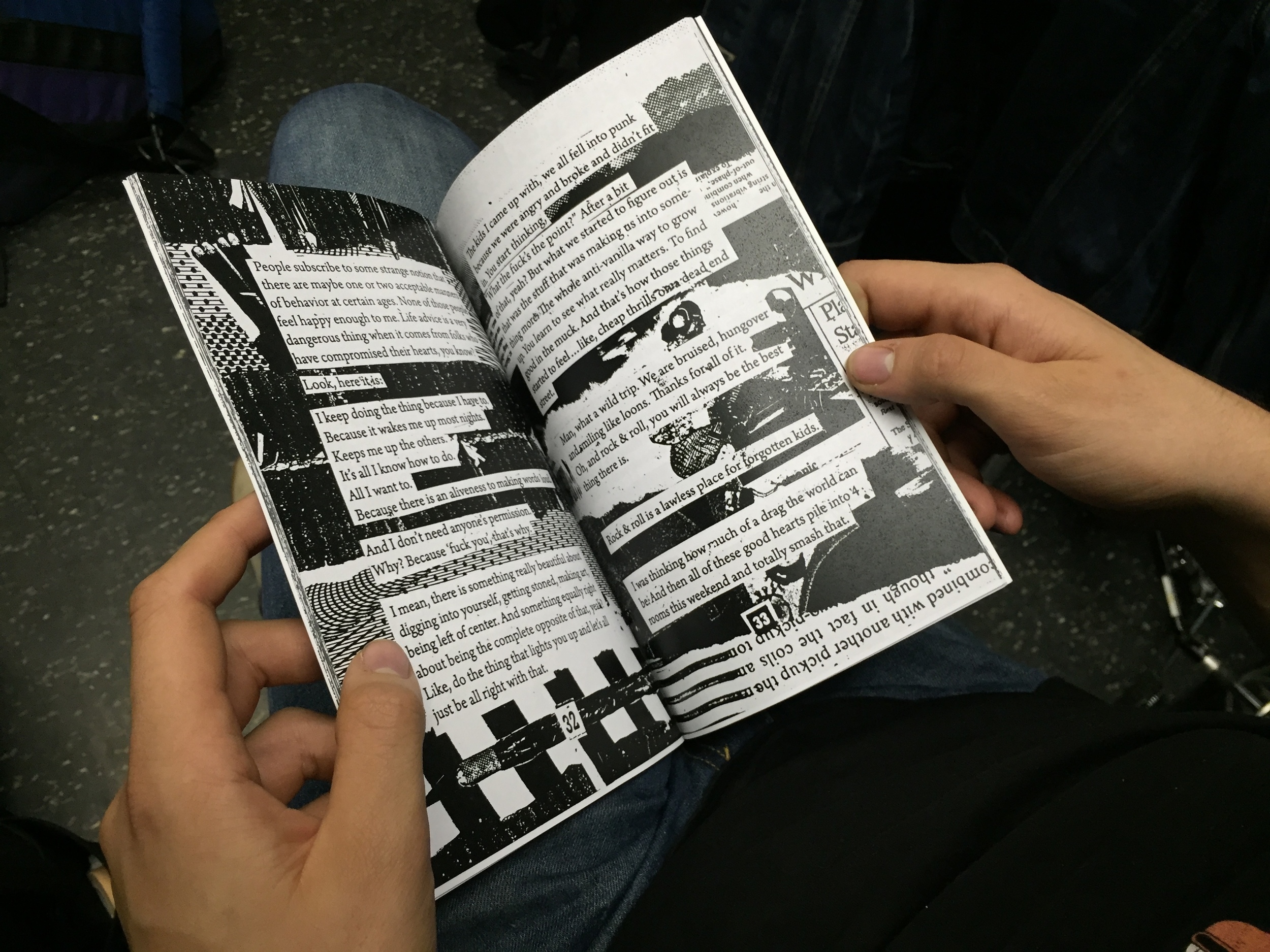
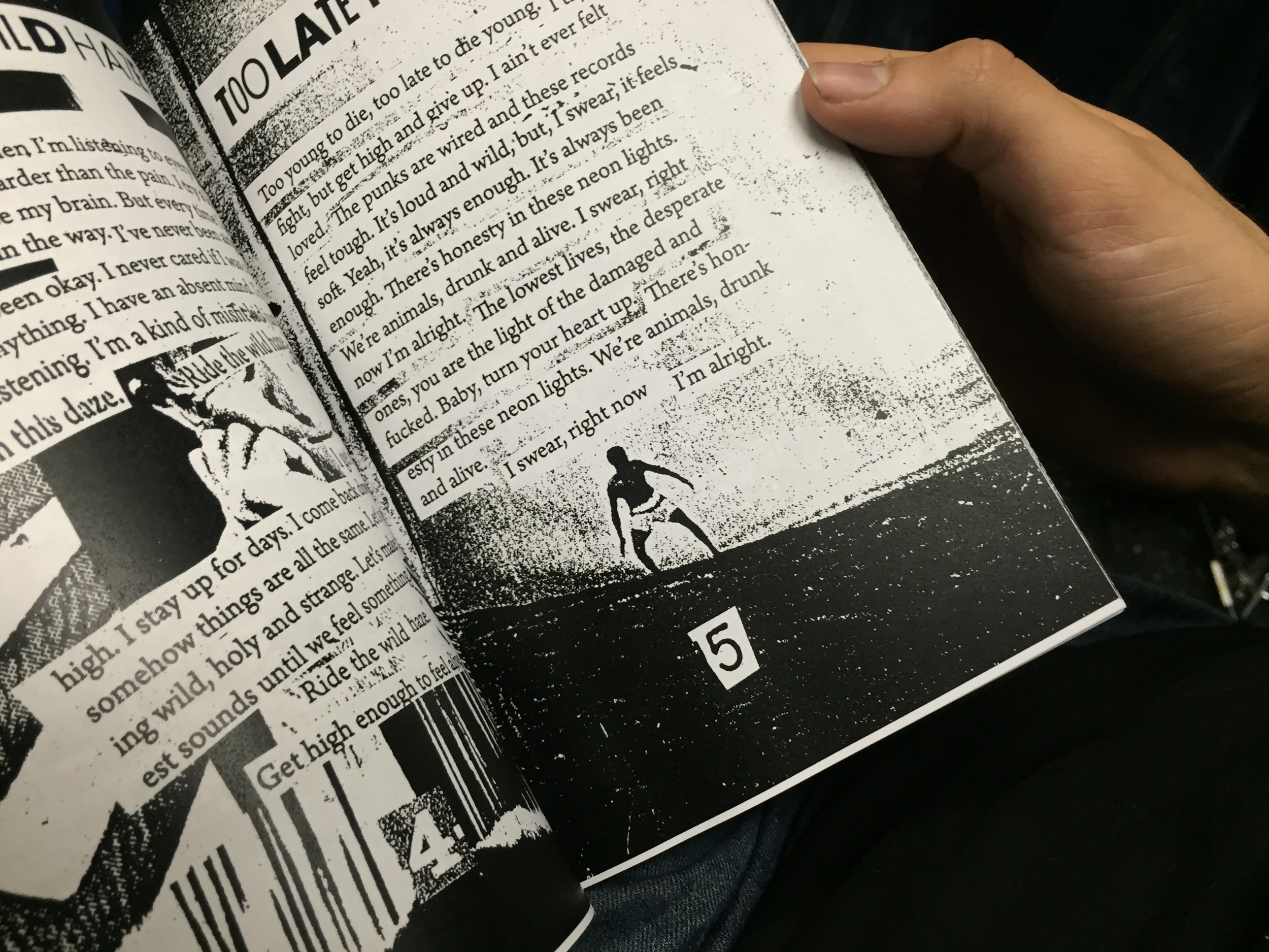
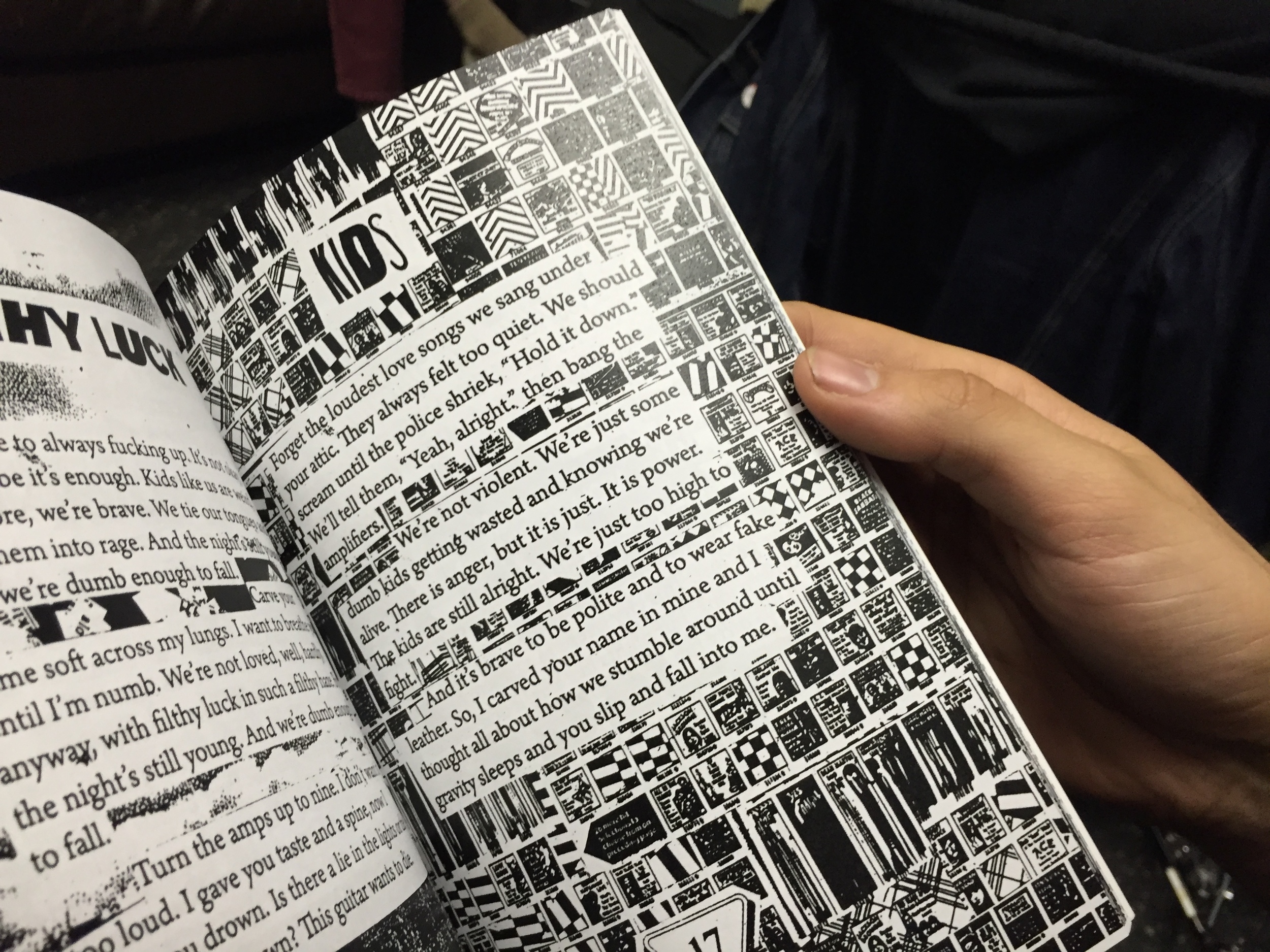
"Even Trash has It's Place" Book design
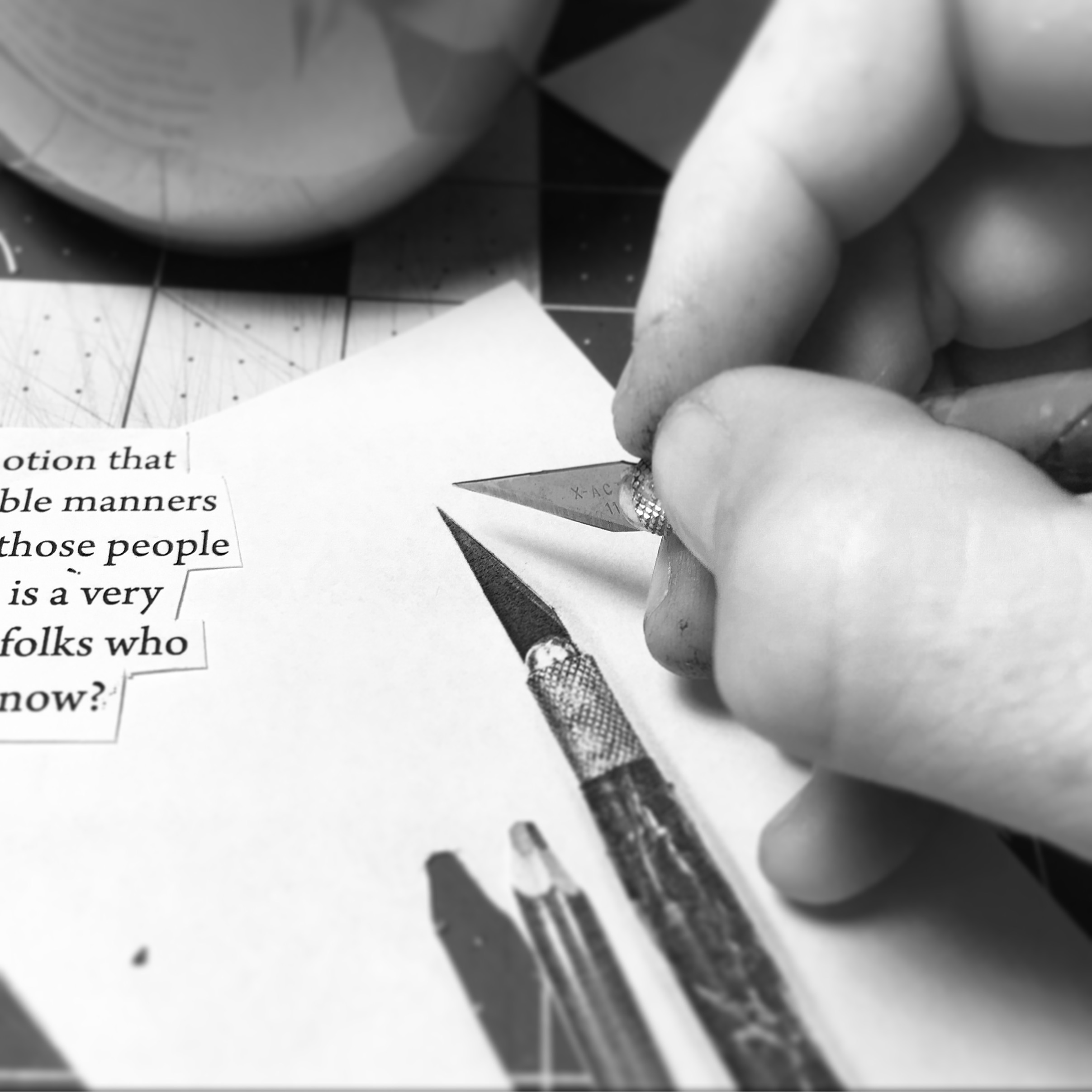
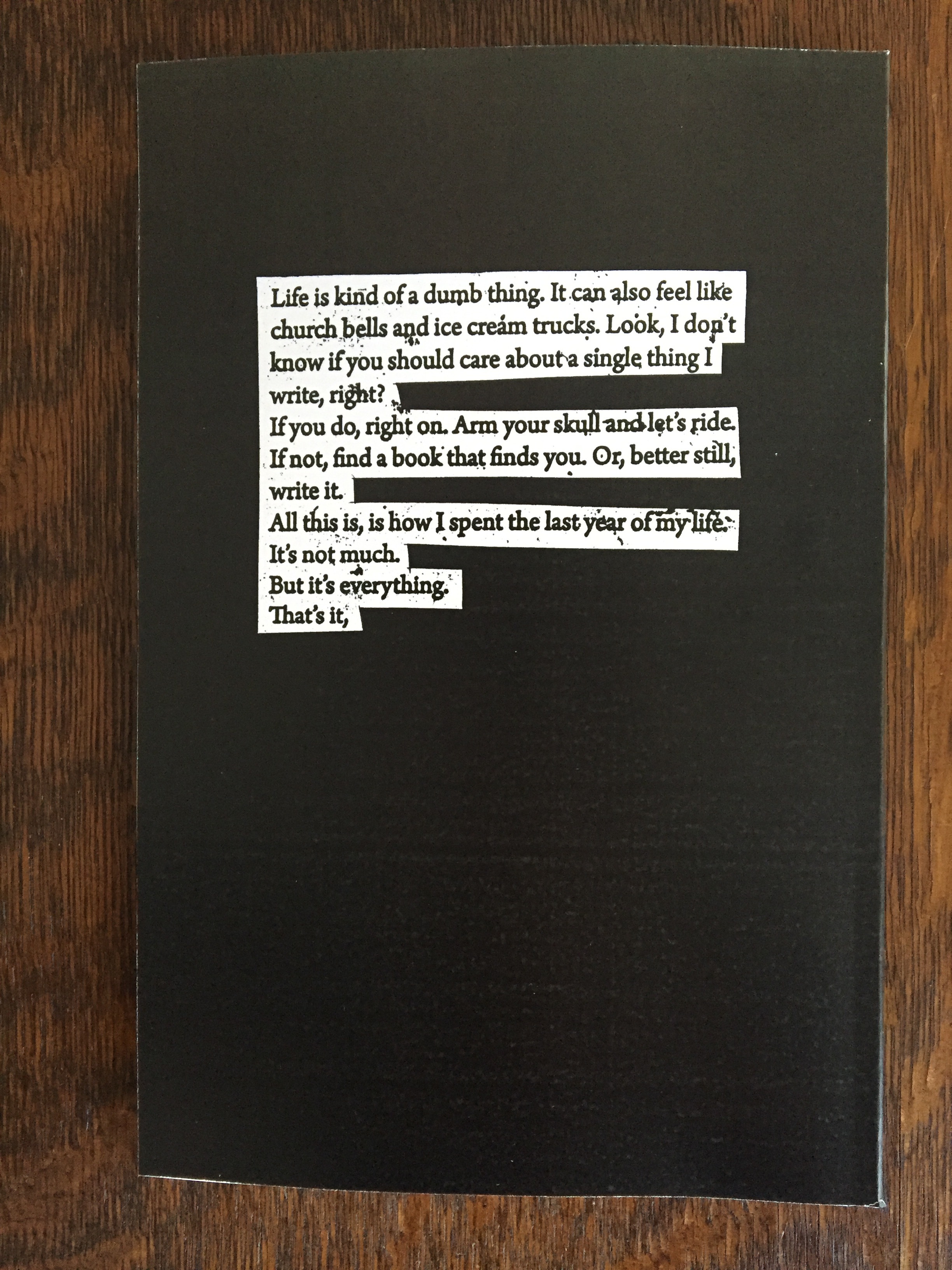
This book, written by my former band mate James, came to me in the form of a text-only PDF of poetry and writings and in just a little over a week I turned that PDF into 50 pages of hand made, cut and paste collage art. Each page fits the theme of the writing, even drawing imagery from the content and referencing memories attached to bit of the writing. For each page I would look through piles of source material, compiling a hand full of images, textures and patterns - then carefully cut each element out, adding it to a one-and-done real life composition. I would then individually cut out each line of writing, then reassemble the whole thing on top of the freshly made composition. The pages were created at a 1.5:1 scale so that I could scan each page in at a high resolution, retaining every bit of detail. And yes, I hid all kinds of (mostly innocent) little things throughout the book.
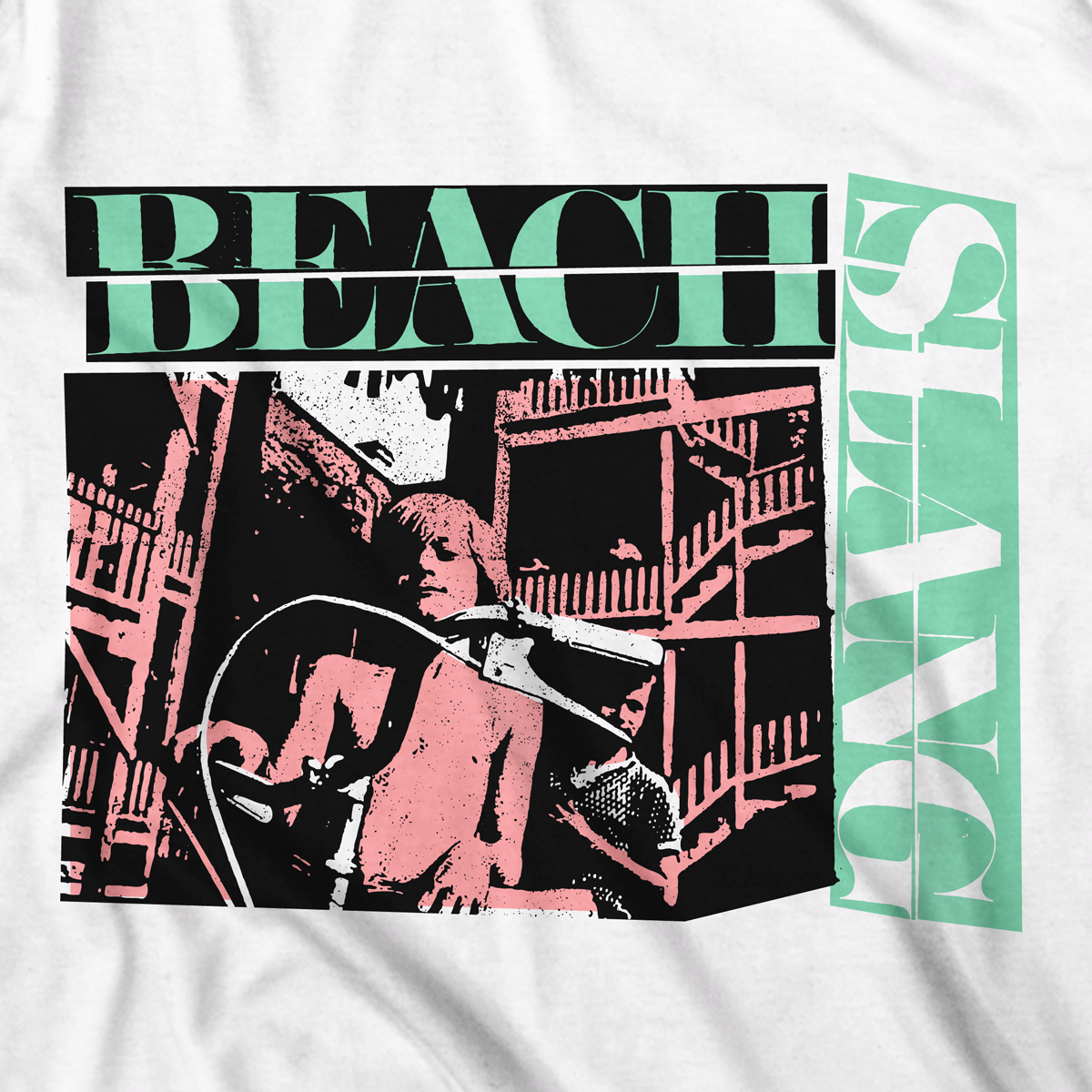
Apparel Design


Poster design and screen printing
In addition to designing these posters, unless otherwise noted, I also hand printed them in my basement with the assistance of a band mate or friend. Having my hands on the squeegee in many cases allowed me to keep the quality of the final product up to par, while also allowing us (the band) to keep our costs very low. It also allowed us to often sell our posters for much less than other bands might have for those same reasons.

Tour Poster, 2015. 2 colors, Black and Neon Pink on white 19"x25" archival cover stock. Edition of 75.

Pre-Order exclusive poster for LP 1. 2 colors, Teal Blue over a split fountain of Neon Orange-to-Neon Pink on white 19"x25" archival cover stock. Edition of 100.

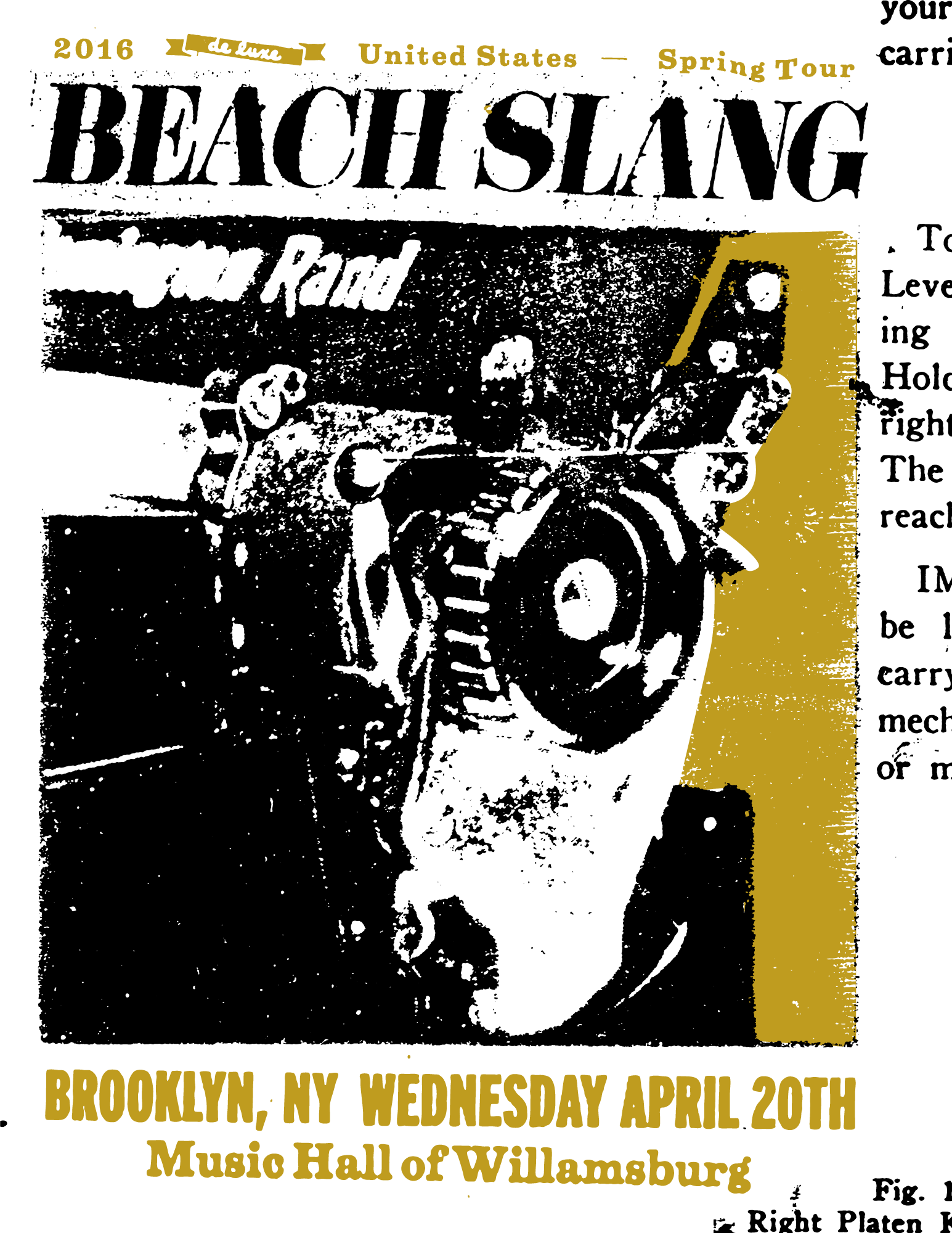
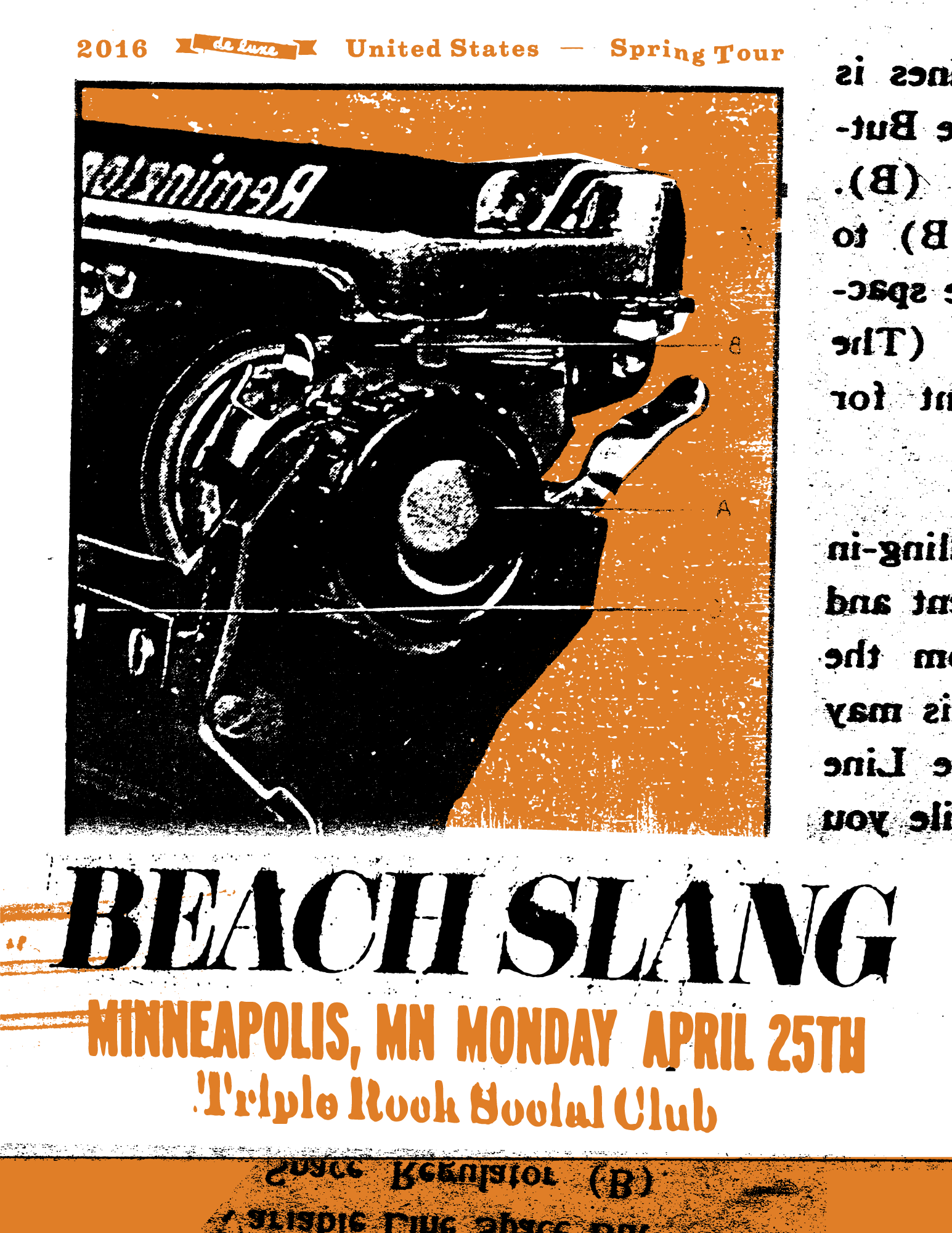
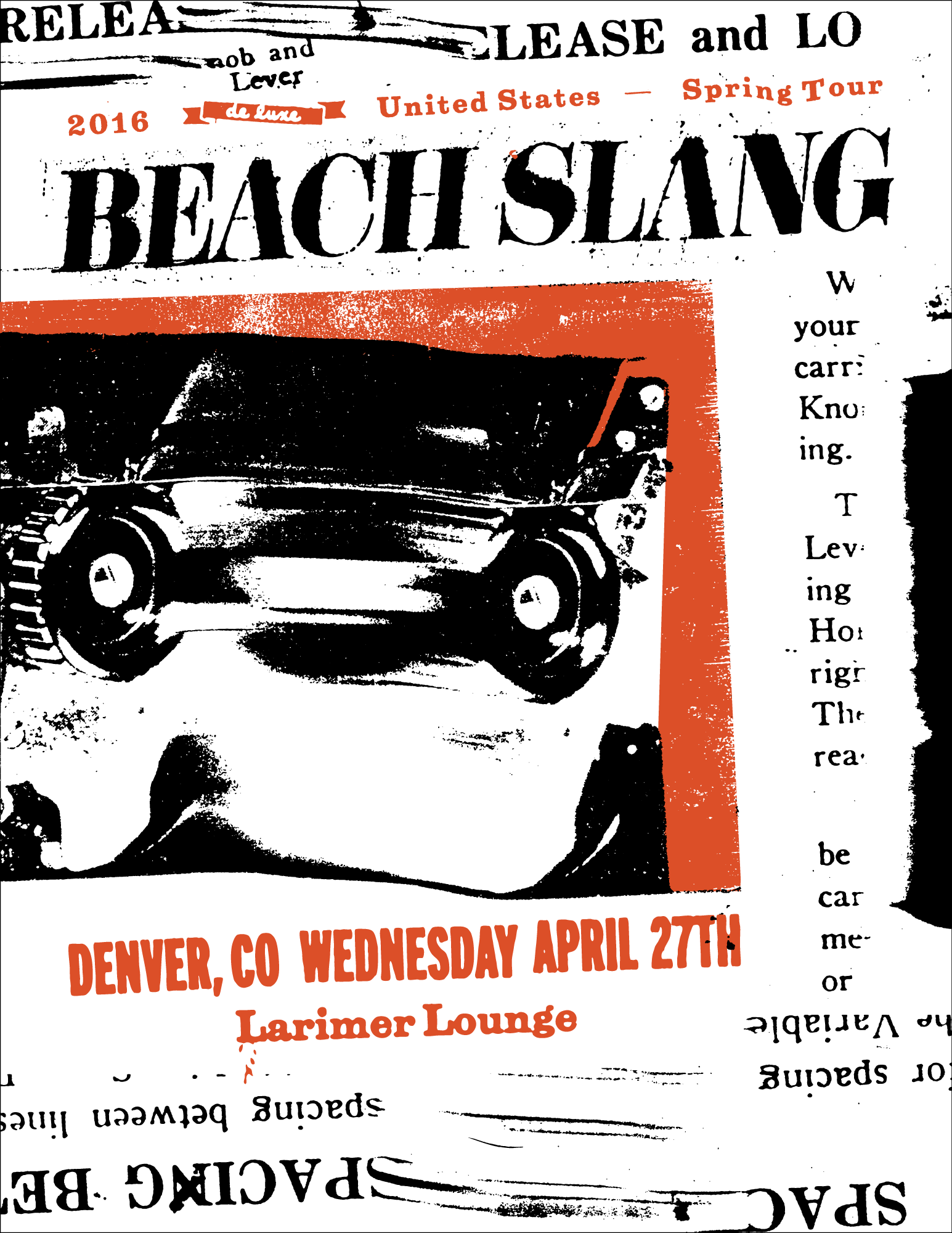
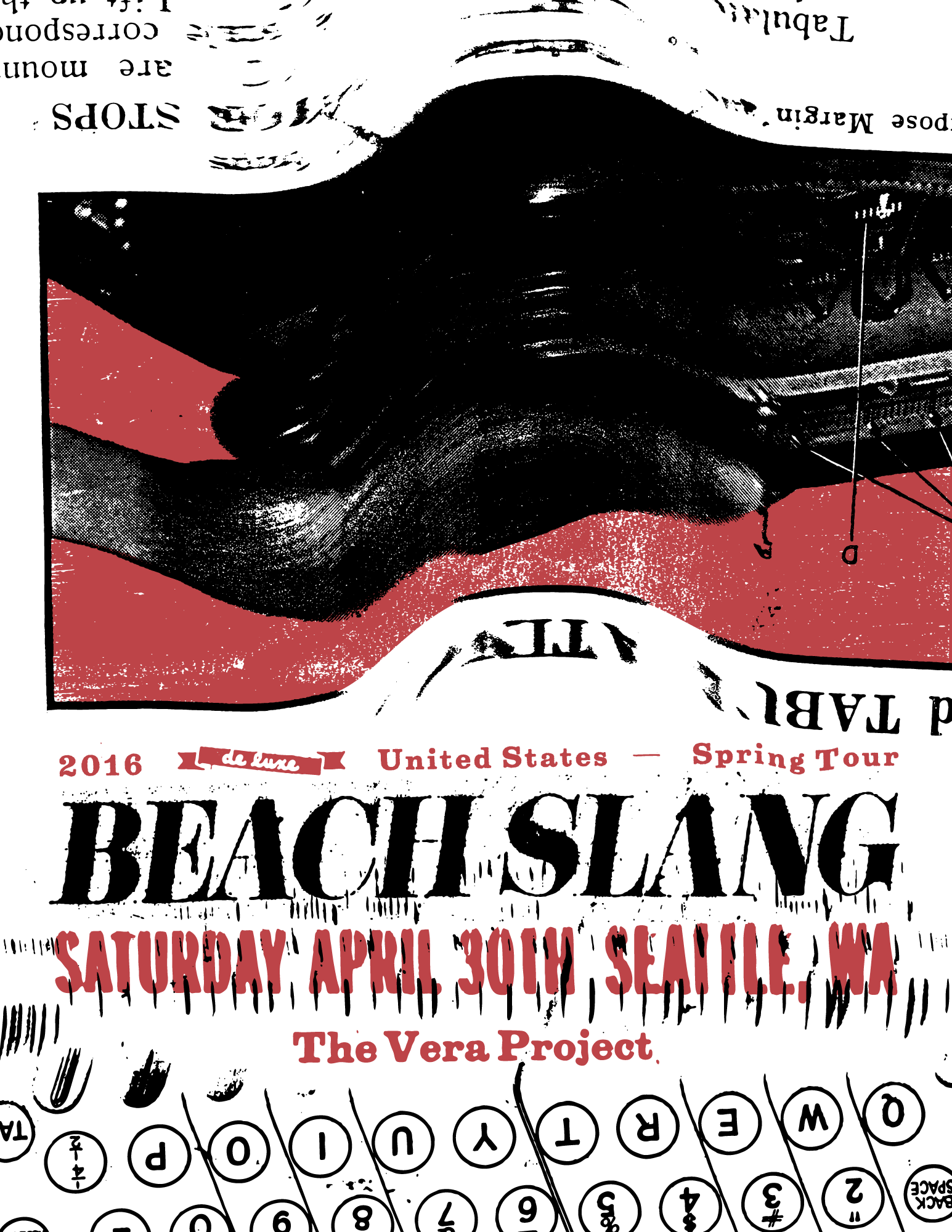
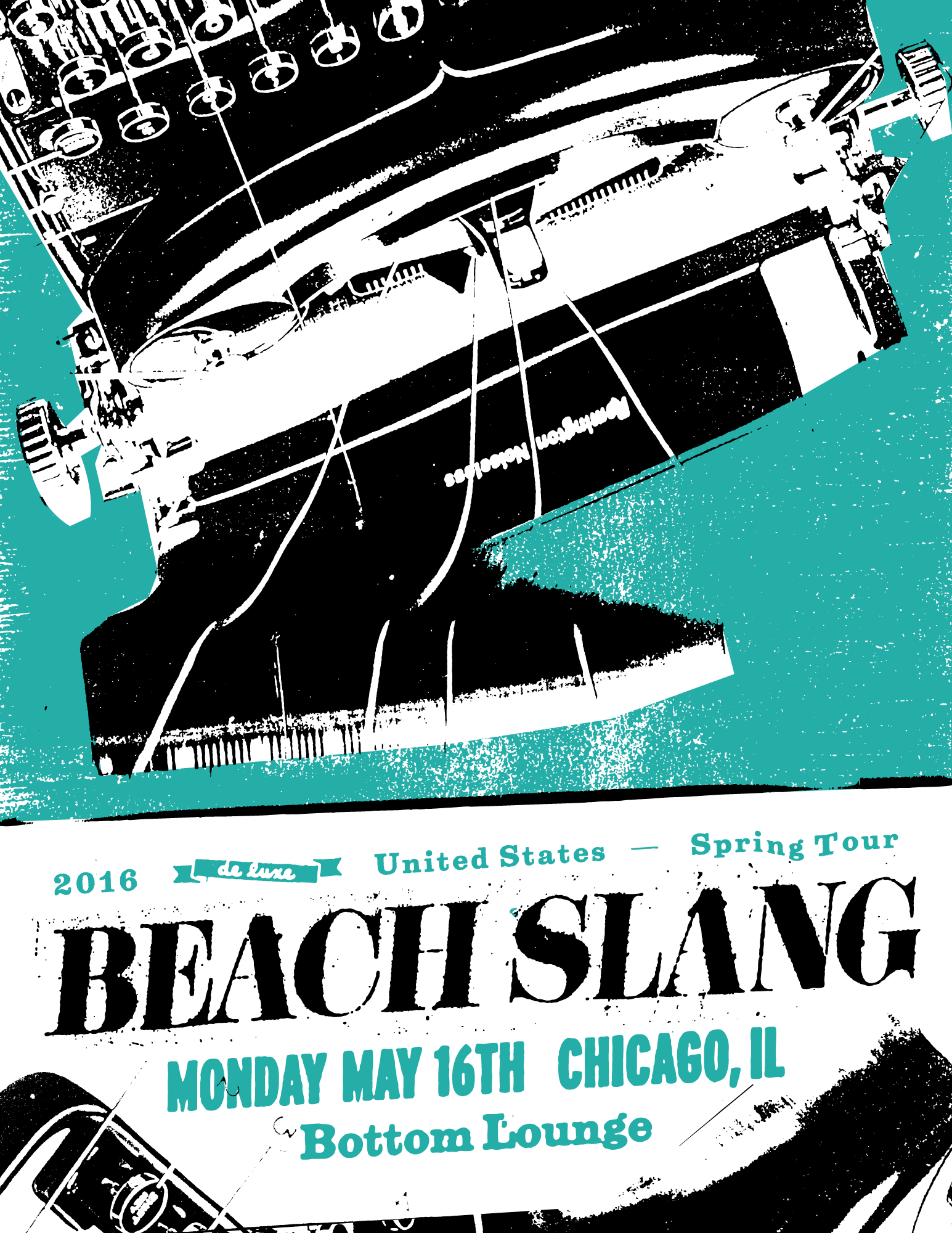
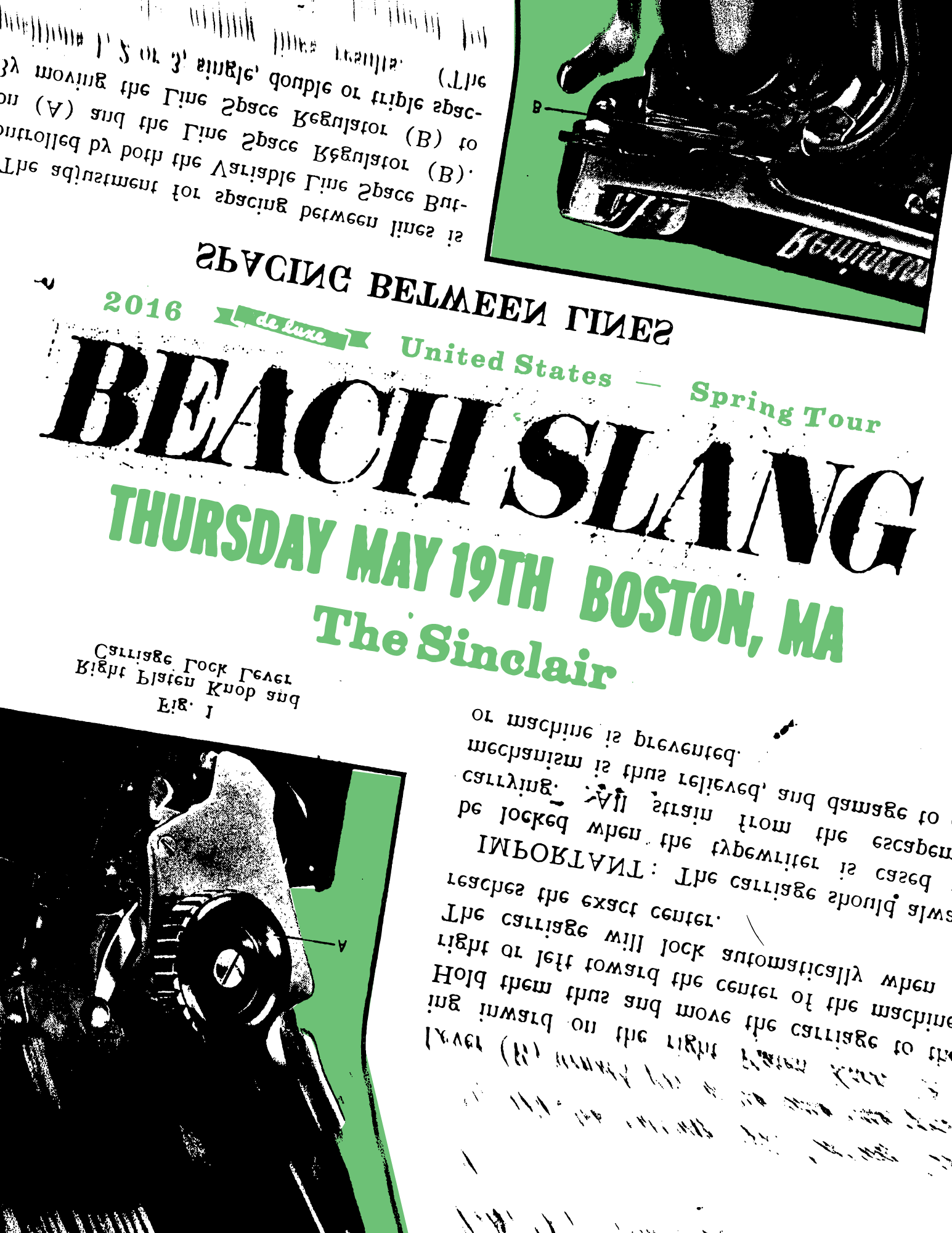
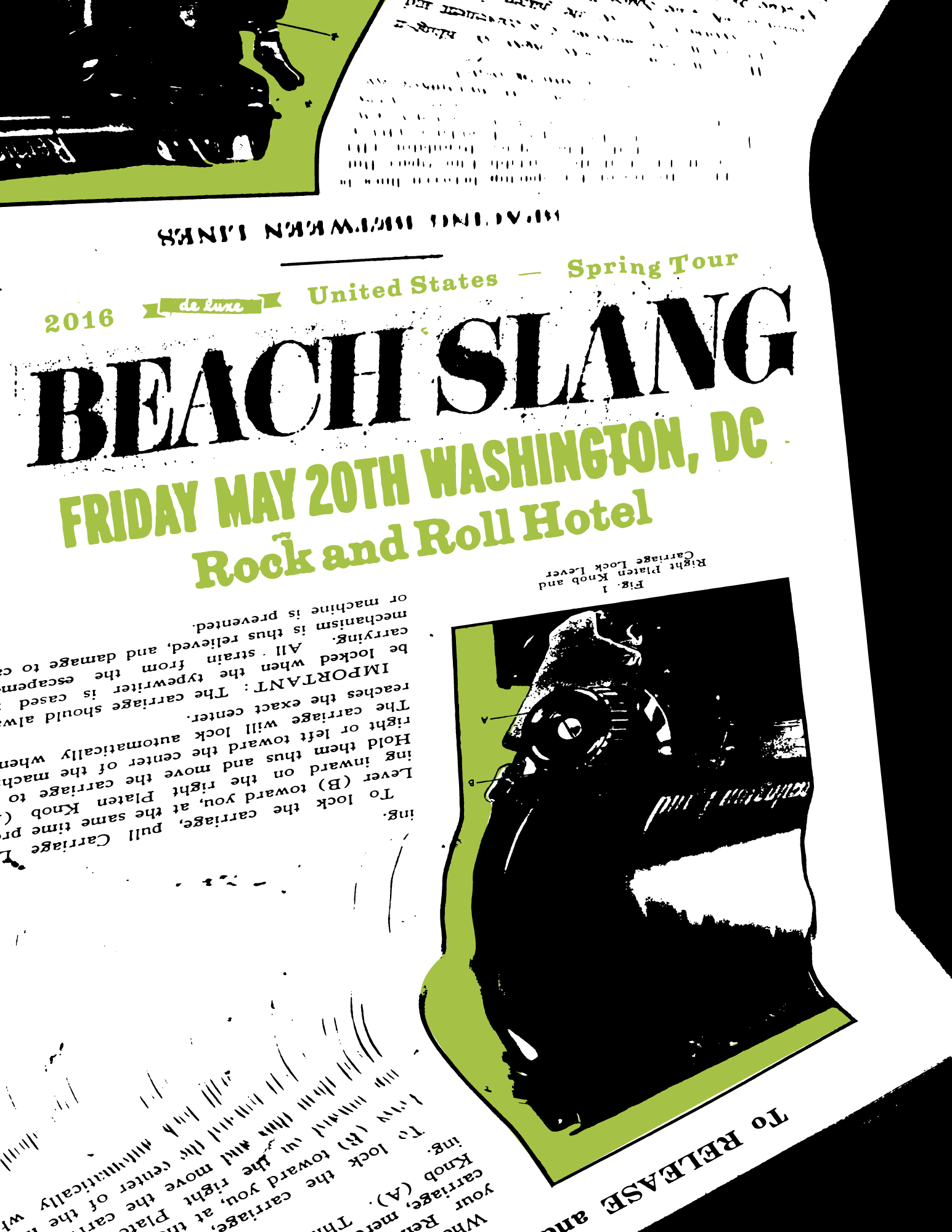
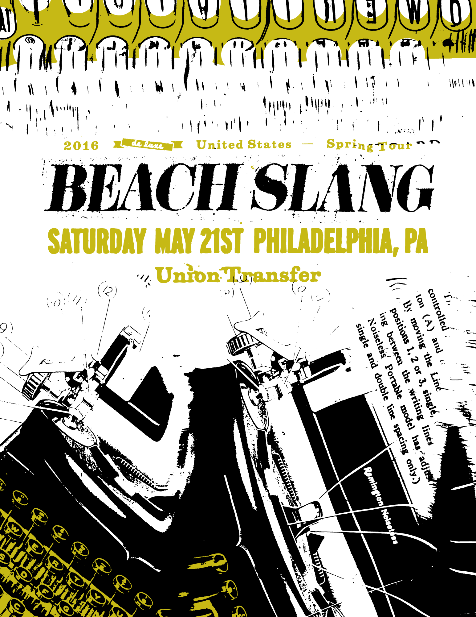
Tour Poster, 2016. 2 Colors, golden yellow and black on white 19"x25" archival cover stock. Edition of 100. (Printed by Shawn Hileman at Masthead Print Studio.)
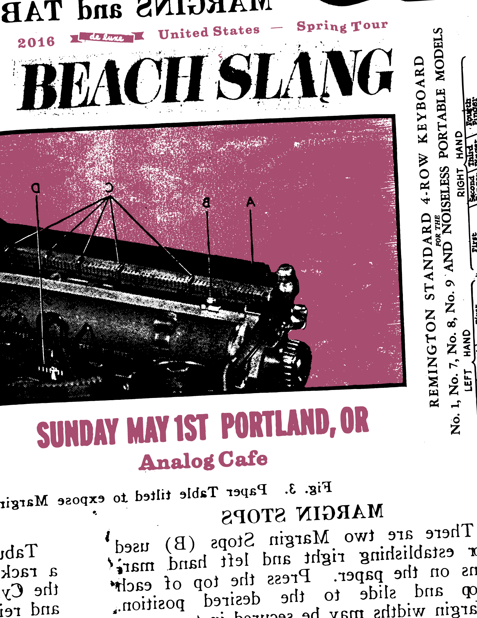
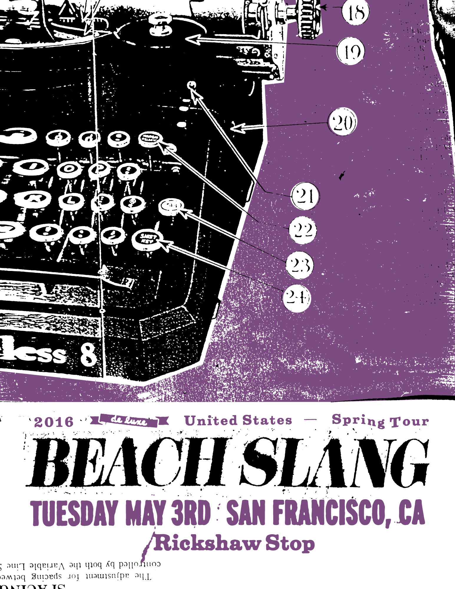
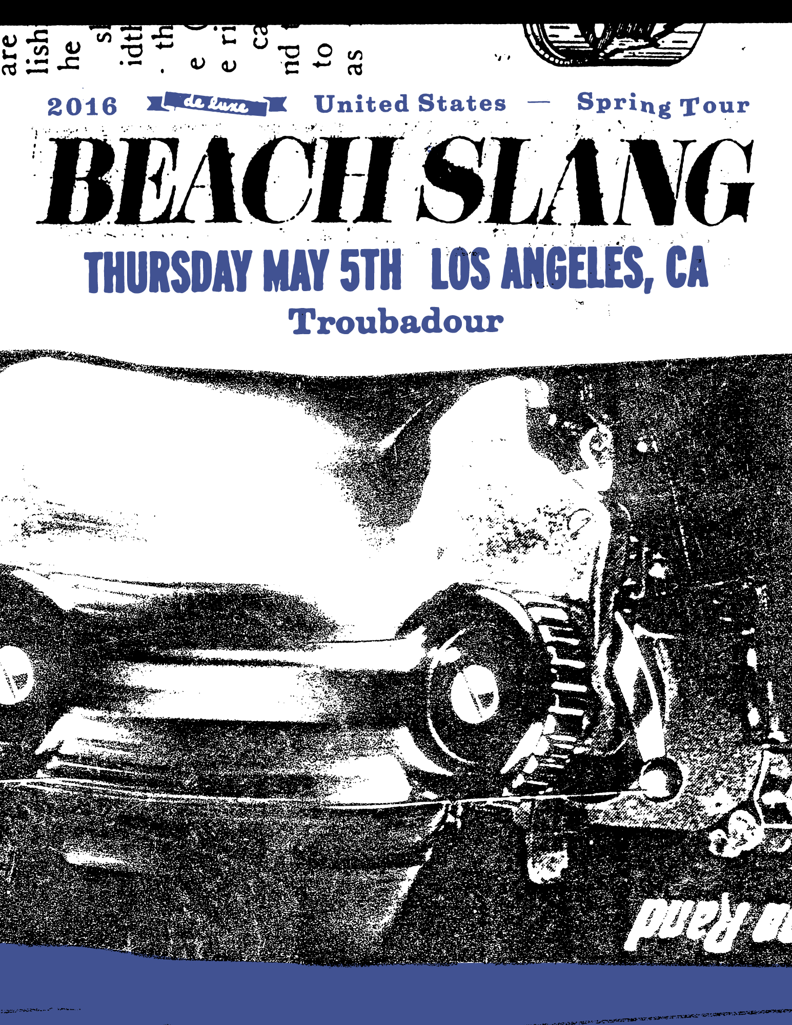
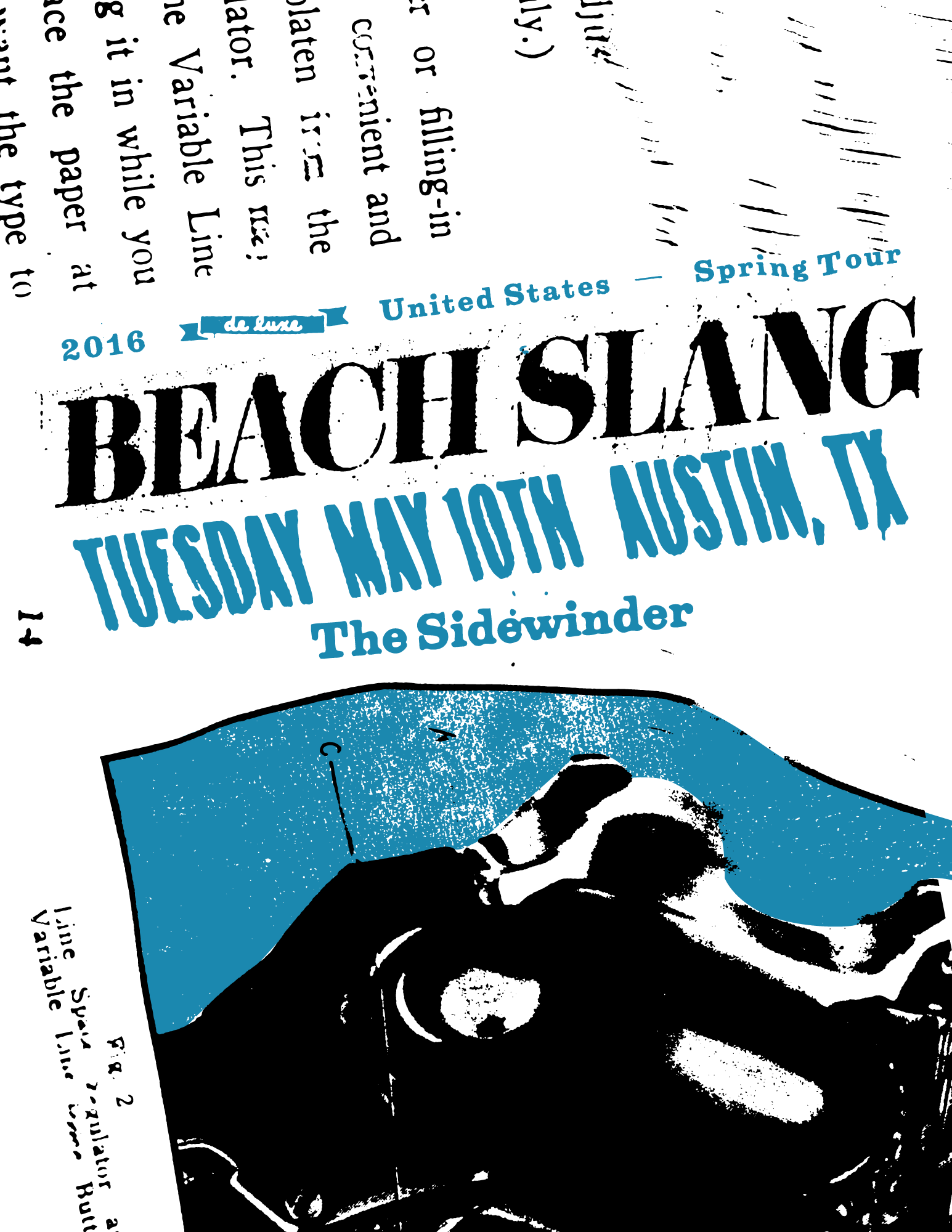
For the 2016 Spring U.S. tour, I created matching individual show posters for a few of the larger shows on our tour. The color of each poster shifted along the spectrum chronologically as the tour progressed.